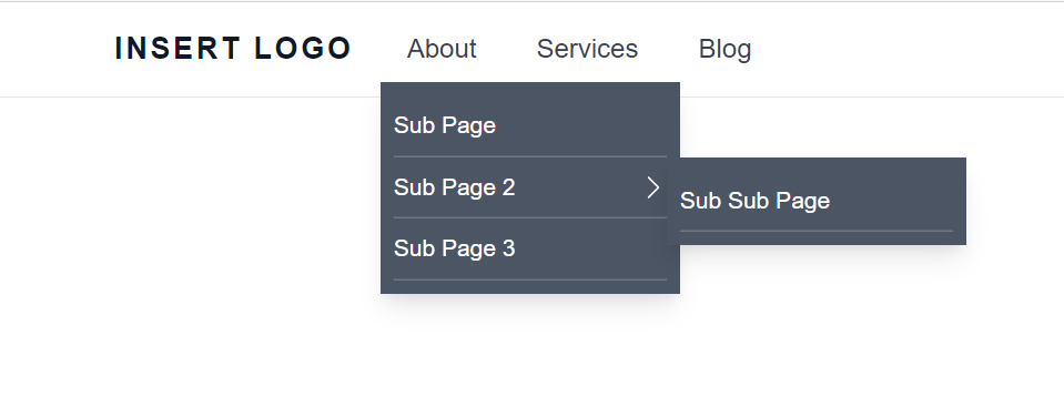
Accessible Dropdown Navigation with Tailwind CSS and Alpine Js
How to create an accessible, keyboard navigable, dropdown navigation with Tailwind CSS, Alpine Js, and Craft CMS.
I have a previous article about how to do hover dropdown menus using Tailwind, however I recently revisited how do this after having a discussion with some colleagues about hover vs click. This was further reinforced after reading this Smashing Mag article: Frustrating Design Patterns: Mega-Dropdown Hover Menus
The main issues I addressed where having the sub menu now open on click vs opening on hover.
I additionally wanted to ensure that this navbar is fully accessible and keyboard navigable. It passes accessibility tests I conducted with the Axe browser extension and I've used it with my keyboard successfully.
On top of the menu being accessible I've also added a skip to main link for keyboard users and screen readers.
I haven't yet used it on a production site, but do have it added to my Craft Starter site so will now be included in all future builds I do.

Accessible Dropdown Navigation
Build the Navigation with a Structure
In Craft we're using a Structure for our entries and this code will build the entire nav from the structure. If you have entries that need to be excluded from the nav then you could add a lightswitch field hideFromNav and exclude from results based on that.
I'm using Tailwind, with JIT enabled, for css and AlpineJs for javascript.
I have some of the styling in app.css
/* add the following styles to tailwinds components layer */
@layer components {
a.skip-main {
@apply absolute top-[40px] w-[1px] h-[1px] overflow-hidden;
left: -999px;
z-index: -999;
background: #2d2828;
}
a.skip-main:focus,
a.skip-main:active {
@apply text-white bg-[#2d2828] left-[5px] top-[50px] min-w-[200px] text-center my-[10px] mx-[5px] p-[10px] text-base z-[999] no-underline border border-black;
}
/* Nav */
nav li {
transition-duration: 0.5s;
}
nav li:hover,
nav li:focus-within {
@apply cursor-pointer;
}
nav li.no-pointer:hover,
nav li.no-pointer:focus-within {
@apply cursor-default;
}
nav ul li ul {
@apply bg-white lg:left-0 px-0 py-1 lg:shadow-lg lg:absolute bg-gray-400 lg:max-w-[180px] w-full lg:w-[180px] lg:min-w-[180px] pl-8 lg:pl-0;
z-index:9999;
transition: all 0.5s ease;
right: -20px;
}
nav ul li a {
@apply block bg-transparent group-hover:text-white group-hover:bg-gray-400;
}
nav ul li:hover > a {
@apply text-gray-900;
}
nav ul li ul ul {
@apply top-0;
right: -180px;
left:auto;
}
nav ul li img {
@apply absolute right-[10px];
top: calc(50% - 4px);
}
/* end nav */
}
Below is the html, AlpineJs, and CraftCMS code for the full nav.
While the nav requires a click to open, it will close as soon as you mouse off of the dropdown/flyout due to this bit of Alpine code on the list item @mouseleave="isOpen = false"
If you do not use Craft CMS then you can copy the working HTML out of the codepen at the bottom of the page.
<nav class="bg-white border-b border-gray-200">
<div class="w-full text-gray-700 max-w-screen container">
<div x-data="{ open: false }" class="flex flex-col mx-auto ax-w-screen lg:flex-row">
<div class="flex flex-row items-center justify-between px-4 py-2">
<a href="{{siteUrl }}" class="text-lg font-semibold tracking-widest text-gray-900 uppercase dark-mode:text-white focus:outline-none focus:shadow-outline">
insert logo
<span class="sr-only">Home</span>
</a>
<button class="mr-8 rounded-lg md:mr-12 lg:hidden focus:outline-none focus:shadow-outline" @click="open = !open">
{# close icon at mobile #}
{{ svg('@webroot/assets/images/svg/close.svg')|attr({ class:'h-6 w-6', 'x-show':'open', 'x-cloak':''}) }}
<span class="sr-only" x-show="open">Close Menu</span><!-- /.sr-only -->
{# hamburger menu at mobile #}
{{ svg('@webroot/assets/images/svg/hamburger.svg')|attr({ class:'h-6 w-6', 'x-show':'!open'}) }}
<span class="sr-only" x-show="!open">Open Menu</span><!-- /.sr-only -->
</button>
</div>
<nav class="flex-col flex-grow hidden h-screen pb-4 lg:pb-0 lg:flex lg:justify-start lg:flex-row lg:h-auto" aria-label="Main Navigation" :class="{'flex': open, 'hidden': !open}">
<ul class="flex flex-col flex-wrap pl-0 m-0 lg:flex-row">
{% set pages = craft.entries.section('pages').hideFromNav('0').level('<='~4).all() %}
{% nav entry in pages %}
<li class="group relative
{# conditionally add classes to either top level entries or child entries #}
{{ entry.level =='1' ? 'block lg:px-0 xl:px-0 mr-1 py-2':'border-b border-white border-opacity-[0.2]' }}"
{# if entry has children make it a dropdown/flyout #}
{{ entry.hasDescendants ? 'x-data="{isOpen:false }" @mouseleave="isOpen = false"':'' }}>
<a href="{{ entry.hasDescendants ? '#' : entry.url }}"
class="py-2
{{ entry.level =='1' ? 'px-4 group-hover:bg-gray-400 group-hover:text-white':'text-white bg-transparent hover:text-gray-100 lg:text-sm' }}"
{% if entry.hasDescendants %}
@click="isOpen = !isOpen"
x-on:click.prevent
:class="{'' : isOpen}"
{% endif %}>
{{ entry.title }}
</a>
{# display all child entries #}
{% ifchildren %}
{#
if has children and is not a top level entry
then add a left chevron
#}
{% if entry.level !="1" %}
<svg xmlns="http://www.w3.org/2000/svg" fill="white" width="16" height="16" class="hidden lg:inline-block fill-white absolute top-[10px] right-0" viewBox="0 0 16 16">
<path fill-rule="evenodd" d="M4.646 1.646a.5.5 0 0 1 .708 0l6 6a.5.5 0 0 1 0 .708l-6 6a.5.5 0 0 1-.708-.708L10.293 8 4.646 2.354a.5.5 0 0 1 0-.708z"/>
</svg>
{% endif %}
{# wrap children with ul and display them #}
<ul
class="bg-gray-600 p-2"
aria-label="submenu"
x-show="isOpen"
@click.away="isOpen = false">
{# display parent entry again
since it's not reachable by click
#}
<li class="group relative border-b border-white border-opacity-[0.2]">
<a href="{{ entry.url }}" class="py-2text-white bg-transparent hover:text-gray-100 lg:text-sm">{{ entry.title }}</a>
</li><!-- /.p-3 bg-green-200 -->
{# end show parent entry #}
{% children %}
</ul>
{% endifchildren %}
{# end children #}
</li>
{% endnav %}
</ul>
</nav>
</div>
</div>
</nav>
Overall I'm quite happy with this as an improvement over my previous approach to dropdown navigation. It's accessible, keyboard navigable and works equally well at desktop and mobile. In additional this address the hover vs click to display dropdowns.
Finally if there are children then we add the parent entry to the dropdown/flyout so that it can be reached by click since clicking the parent opens the dropdown.
See working example in codepen below


