Dark Mode with AlpineJs and Tailwind
I added a dark mode option to the Website 101 Podcast site. I was inspired to do this when a colleague mentioned that he was working on one for a client site. Haven't had an opportunity to do this yet and wanted to see what is involved to get dark mode working that would also respect system settings.

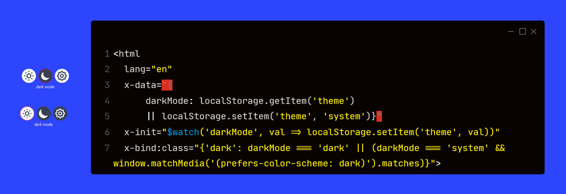
Here we can see a screenshot of the working buttons. We have light mode, dark mode and system. When active that button is outlined in red. If system is selected and your system is set to dark the icons background will be dark and light if your setting is light.
Requirements
Alpine Js 3.x
To get started add the following to your tailwind.config.js file darkMode:'class' and the following to your opening html tag.
<html
lang="en"
x-data="{
darkMode: localStorage.getItem('darkMode')
|| localStorage.setItem('darkMode', 'system')}"
x-init="$watch('darkMode', val => localStorage.setItem('darkMode', val))"
x-bind:class="{'dark': darkMode === 'dark' || (darkMode === 'system' && window.matchMedia('(prefers-color-scheme: dark)').matches)}">
What we're doing here is setting x-data to currentTheme. If currentTheme exists get it out of localStorage. If it doesn't exist set the value to system.
Now on page load the correct theme is displayed defaulting to your system settings. x-bind:class adds a class to the html tag of Dark if currentTheme is dark or if it is system and the system settings is set to dark.
Next add the code for the buttons - icons come from heroicons
<div x-cloak class="relative inline-flex items-center gap-2 mr-2 sm:pb-2">
<p class="absolute w-full text-sm text-center -bottom-3 lg:-bottom-1">dark mode</p>
{# light #}
<button x-on:click="darkMode = 'light'">
<svg xmlns="http://www.w3.org/2000/svg"
x-bind:class="{'border-2 border-red/50': darkMode === 'light'}"
class="w-6 h-6 p-1 text-gray-700 transition rounded-full cursor-pointer bg-gray-50 hover:bg-gray-200" fill="none" viewBox="0 0 24 24" stroke="currentColor" stroke-width="2">
<path stroke-linecap="round" stroke-linejoin="round" d="M12 3v1m0 16v1m9-9h-1M4 12H3m15.364 6.364l-.707-.707M6.343 6.343l-.707-.707m12.728 0l-.707.707M6.343 17.657l-.707.707M16 12a4 4 0 11-8 0 4 4 0 018 0z" />
</svg>
<span class="sr-only">light</span>
</button>
{# dark #}
<button x-on:click="darkMode = 'dark'">
<svg xmlns="http://www.w3.org/2000/svg"
x-bind:class="{'border-2 border-red/50': darkMode === 'dark'}"
class="w-6 h-6 p-1 text-gray-100 transition bg-gray-700 rounded-full cursor-pointer dark:hover:bg-gray-600" viewBox="0 0 20 20" fill="currentColor">
<path d="M17.293 13.293A8 8 0 016.707 2.707a8.001 8.001 0 1010.586 10.586z" />
</svg>
<span class="sr-only">dark</span>
</button>
{# system #}
<button x-on:click="darkMode = 'system'">
<svg
xmlns="http://www.w3.org/2000/svg"
x-cloak
x-show="! window.matchMedia('(prefers-color-scheme: dark)').matches"
x-bind:class="{'border-2 border-red/50': darkMode === 'system'}"
class="w-6 h-6 p-1 text-gray-700 transition bg-gray-100 rounded-full cursor-pointer hover:bg-gray-200"
fill="none" viewBox="0 0 24 24" stroke="currentColor" stroke-width="2">
<path stroke-linecap="round" stroke-linejoin="round" d="M10.325 4.317c.426-1.756 2.924-1.756 3.35 0a1.724 1.724 0 002.573 1.066c1.543-.94 3.31.826 2.37 2.37a1.724 1.724 0 001.065 2.572c1.756.426 1.756 2.924 0 3.35a1.724 1.724 0 00-1.066 2.573c.94 1.543-.826 3.31-2.37 2.37a1.724 1.724 0 00-2.572 1.065c-.426 1.756-2.924 1.756-3.35 0a1.724 1.724 0 00-2.573-1.066c-1.543.94-3.31-.826-2.37-2.37a1.724 1.724 0 00-1.065-2.572c-1.756-.426-1.756-2.924 0-3.35a1.724 1.724 0 001.066-2.573c-.94-1.543.826-3.31 2.37-2.37.996.608 2.296.07 2.572-1.065z" />
<path stroke-linecap="round" stroke-linejoin="round" d="M15 12a3 3 0 11-6 0 3 3 0 016 0z" />
</svg>
<svg
xmlns="http://www.w3.org/2000/svg"
x-show="window.matchMedia('(prefers-color-scheme: dark)').matches"
x-bind:class="{'border-2 border-red/50': darkMode === 'system'}"
class="w-6 h-6 p-1 text-gray-100 transition bg-gray-700 rounded-full cursor-pointer dark:hover:bg-gray-600"
x-cloak
fill="none" viewBox="0 0 24 24" stroke="currentColor" stroke-width="2">
<path stroke-linecap="round" stroke-linejoin="round" d="M10.325 4.317c.426-1.756 2.924-1.756 3.35 0a1.724 1.724 0 002.573 1.066c1.543-.94 3.31.826 2.37 2.37a1.724 1.724 0 001.065 2.572c1.756.426 1.756 2.924 0 3.35a1.724 1.724 0 00-1.066 2.573c.94 1.543-.826 3.31-2.37 2.37a1.724 1.724 0 00-2.572 1.065c-.426 1.756-2.924 1.756-3.35 0a1.724 1.724 0 00-2.573-1.066c-1.543.94-3.31-.826-2.37-2.37a1.724 1.724 0 00-1.065-2.572c-1.756-.426-1.756-2.924 0-3.35a1.724 1.724 0 001.066-2.573c-.94-1.543.826-3.31 2.37-2.37.996.608 2.296.07 2.572-1.065z" />
<path stroke-linecap="round" stroke-linejoin="round" d="M15 12a3 3 0 11-6 0 3 3 0 016 0z" />
</svg>
<span class="sr-only">system</span>
</button>
</div>
The system button has two svgs the x-show attribute determines which one displays depending on whether the system setting is set to dark or light. Also have screen-reader classes inside each button for accessibility.
When I find some time, I'll add dark mode to this site as well. The time consuming part of adding in dark mode is choosing the colors and style changes that are applied when dark mode is on.


