---
title: "Responsive Tables with Craft CMS, Table Maker, and Tailwind"
date: 2020-04-17T10:40:00-04:00
author: cc_admin
canonical_url: "https://caffeinecreations.ca/blog/responsive-tables-with-craft-cms-table-maker-and-tailwind/"
section: Blog
---

- [Web Development](https://caffeinecreations.ca/blog/category/web-development/), [Code](https://caffeinecreations.ca/blog/category/code/), [Tutorial](https://caffeinecreations.ca/blog/category/code/tutorial/), [CraftCMS](https://caffeinecreations.ca/blog/category/craftcms/), [Craft Tips](https://caffeinecreations.ca/blog/category/craftcms/craft-tips/)
# Responsive Tables with Craft CMS, Table Maker, and Tailwind
I'm working on a site that the client needs to be able to create any number of tables with any number of columns and rows. Hand coding tables is not easy and one cannot expect a client to do that. Fortunately in Craft there is a plugin that makes it easy for clients to do just this.
[Table Maker](https://plugins.craftcms.com/tablemaker): A field type that enables your users to create their own columns, controlling the width and alignment of each:
I have the table maker field type in a matrix block allowing the client to add as many tables as they need to the entry.
A table with a lot of tables is not going to work on tablets or phones so we need to ensure that it looks good on both.
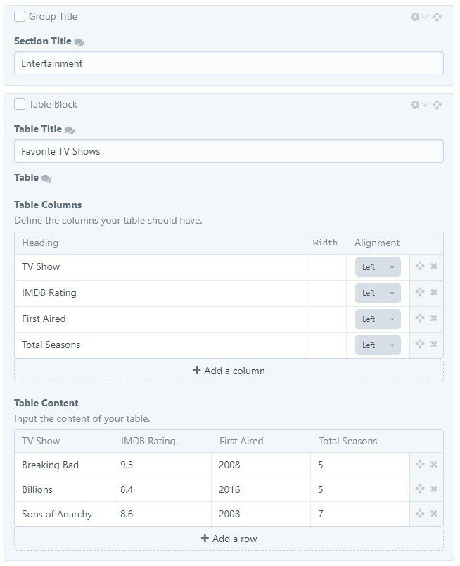
Table Maker Publish View
Above is how table maker works in the entry publish screen. Create as many columns as you want and the table content section updates the columns automatically. Once you do that, fill in your table data and you're done.
Table Maker will output a table for you with one line of code but it's just a plain table and won't look like your designs. It's better to use the custom code option so you can have it match your sites design.
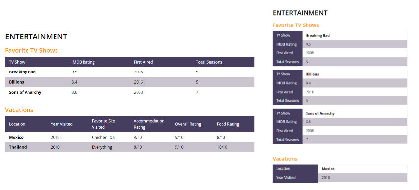
Responsive Table
In the above image we have two tables created with table maker and each has a different number of rows and columns.
The [full code](#full-code) is below but first a couple of notes. The opening table tag we set the table to be `flex flex-row flex-no-wrap` at mobile and then at the md breakpoint we change it to a table with `md:table table-fixed`. Now the table acts like a table at larger than 768px and is flex layout below that.
Let's look at the table head code:
```
```html
{% for row in block.table.rows %}
{% for col in block.table.columns %}
{{ col.heading }}
{% endfor %}
{% endfor %}
```
```
To get the mobile thead to look correct we need to output it for each row of the table. At desktop view we need to hide the additional rows in the head. First we loop through all the table rows and then for each table row we loop through the columns.
The extra rows are hidden on desktop with this conditional in the first loop `{{ loop.first ? '':'md:hidden' }}` which adds a md:hidden class if it's not the first loop.
#### Zebra Striping
Zebra Striping is set at desktop using this` {{ cycle(['md:bg-white', 'md:bg-greyBrand-light'], loop.index0)}}` on the table row of the tbody tag. the [twig cycle tag](https://twig.symfony.com/doc/1.x/functions/cycle.html) makes it easy to alternate classes. notice these classes are prefixed with **md:** that's so they are only applied at desktop.
Mobile zebra striping needs to be done seperately as each cell of the row is on it's own line. This is done on the td tag`{{ cycle(['bg-white md:bg-transparent', 'bg-greyBrand-light md:bg-transparent'], loop.index0)}}` notice that the striping is set, but at **md:** we set the background to transparent so we can see the striping set above at desktop.
No borders at desktop. However at mobile the table looked strange without adding a top, bottom and right border. on the td again. The last cell gets a border bottom and the first cell gets a border top and all cells get a border right.
```
```html
{{ loop.last ? 'border-b md:border-b-0': ''}} {{ loop.index =='1' ? 'font-bold border-t md:border-t-0':'' }} border-r
```
```
#### Complete code block
And the complete code block is below.
```
```html
{% for row in block.table.rows %}
{% for col in block.table.columns %}
{{ col.heading }}
{% endfor %}
{% endfor %}
{% for row in block.table.rows %}
{% for cell in row %}
{{ cell }}
{% endfor %}
{% endfor %}
```
```
## Related Articles
[### Grouping Entries by First Letter of Last Name](https://caffeinecreations.ca/blog/grouping-entries-by-first-letter-of-last-name/)
[### Creating a Simple Job Board in Craft CMS](https://caffeinecreations.ca/blog/creating-a-simple-job-board-in-craft-cms/)
[### Tailwind CSS](https://caffeinecreations.ca/blog/tailwind-css/)